Teca
Providing housing loans backed by digital assets for Nigerians
Project Overview

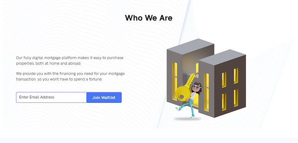
Hero section view of landing page
Role: Content/UX Writer
Tools: Google Docs, Figma
Collaborated with: 1 Designer and a Senior Product Manager
Industry: Technology (Fintech)
Problem / Goals:
Teca is Africa's first digital mortgage platform for first-time homeowners, refinancers, and diasporans. The product is targeted at working-class Nigerians, as well as Nigerians in the diaspora who would like to purchase a home without dealing with the hassle that comes with traditional lenders.
I was contracted into the fully remote team, to write the copy for the landing page and app interface. The goal was to introduce, in the most simple and eye-catching way, the product to potential users. This is because the service was alien to most Nigerians, as such, potential users would need to digest the new technical information about the product in the simplest form.
As a result, the tone of voice was simple and personal.
How I helped:
-
User research
-
Defined tone of voice
-
Wrote and edited web copy and microcopy
Project Requirements
Website Copywriting
Write web copy that aligns with the product's brand archetype as Africa's first digital mortgage platform for Nigerians and diasporans.
In-app Copywriting
Write microcopy for app interface to enable smoother user onboarding and journey while using the product.
Email Marketing
Write a welcome email for users who join the product's waitlist, highlighting some of the perks of using Teca.
Research


User Survey
In writing the website copy, I focused on the brand's target personas. It was necessary to present the product in a modern yet relatable style since the target personas were literate, working-class young adults.
Keywording
I conducted keyword research using Ahrefs Keyword Generator to determine the best keywords to include on the landing page to boost SEO quality and increase traffic to the website.
Approach
Website Copywriting
Since the aim of the brand was to simplify its service, especially with the technical nature of the product's mechanics, I adopted a simple and personal tone of voice. The aim was to help as many users as possible to understand the product's offerings and benefits at first read or interaction.
In-app Copywriting
I adopted the same tone of voice to maintain the brand's consistency throughout the product. I worked with the Senior Product Manager and the designer to craft strategic copy that would improve users' experience while interacting with the product.
Email Marketing
I ensured that the email copy was punchy and straight to the point. After all, the goal was to educate new users, not bore them to death.
FAQs
Being a new product, I realized that potential users would be curious about how Teca works. So, I included an FAQ section to answer the most likely questions users of similar products ask. The questions used in the FAQ section were selected after thorough research and competitor analysis.
Relatable CTA
I used a simple and active CTA (Join Waitlist) to push visitors to take the desired action since the current business goal is to get users to join the waitlist before the product officially goes live and grow the Teca community.
Testimonials
When it comes to selling, one of the best tools to use is social proof. I included a testimonials section, which I titled "Word on the street" to appeal to the target audience. The H2 went through several iterations.
The first option was:
What people are saying
(But, this was too long, too boring and just didn't sound right)
Another option was:
Testimonials
(Yup, if this doesn't scream boring, I don't know what else does.)
Results

Teca has been able to:
-
Get 250+ users to join the waitlist within the first month
-
Double the number of users on the waitlist by the third month.
What I learned
It can be quite a herculean task to simplify very technical concepts, especially if the target audience is people who are new to the product idea. Over-simplifying could take out the excitement about the product, so it was a real challenge to strike that balance between simple and bland.
Here's what I'd do differently now
-
Shorten the paragraph underneath the H1. I'd most likely highlight the main points using bullet points.
*Product is still in development
Check live product here.
Love my work? Drop me a line.


